Color Theory: Painting with Only Two Colors
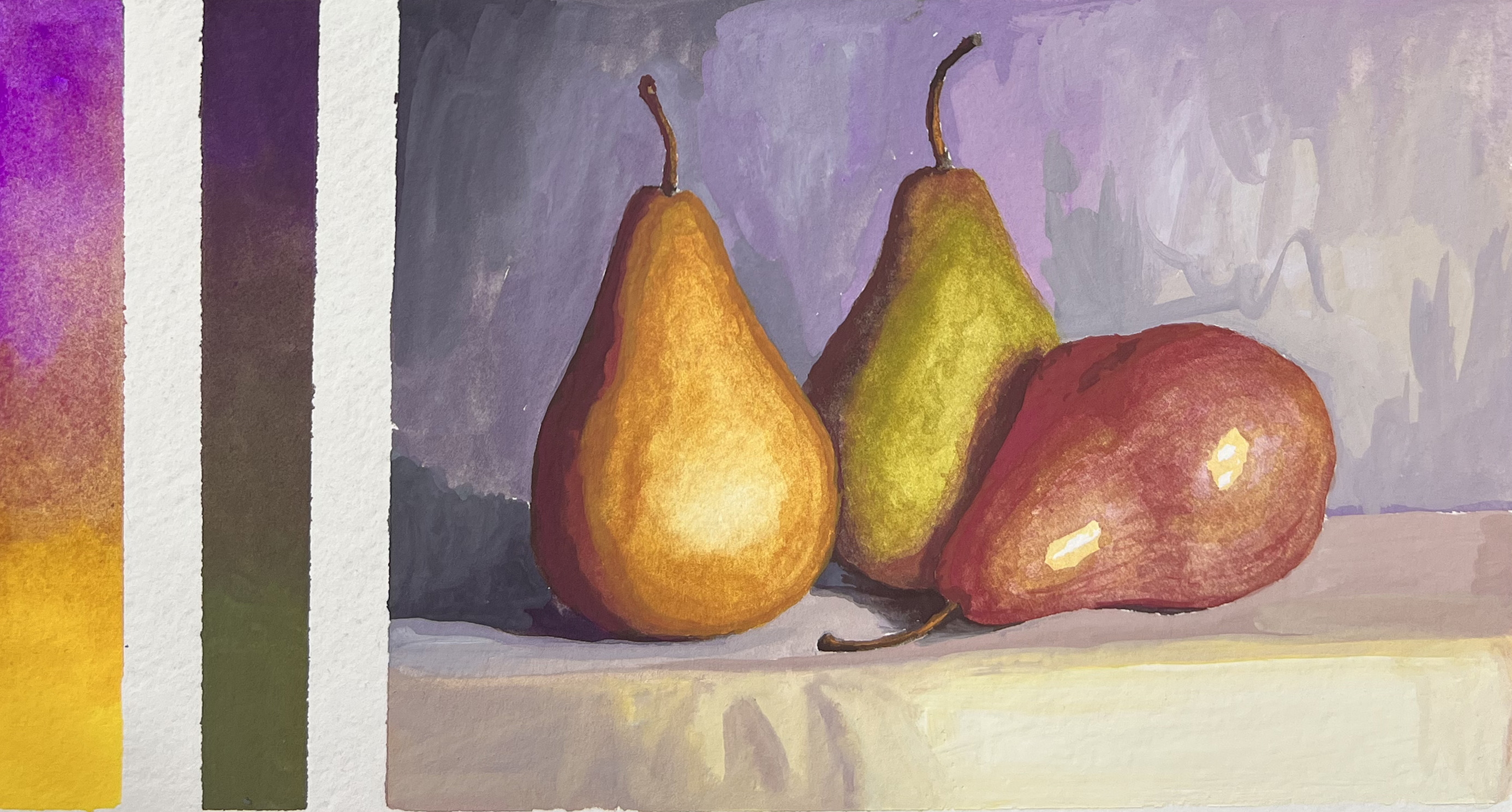
OK, I admit that statement could be a little misleading. The entire palette in the above painting was Quinacridone Magenta, Cadmium Yellow, Black and White. This palette was a discovery that I made while teaching Color Theory for Painters, a course I designed to help artists understand the logic and limits of color.
So how can this palette of Magenta and Yellow yield reds, greens, and purples?
Here's the short answer: Black and white are actually blues, red is not a primary color, and hues appear relative to their surroundings.
If you know me, though, you know I don't usually stop with the short answer. That's because I'm curious and enjoy learning and understanding all the layers that make up our world, how we see it, and how we can paint it.
In this particular lesson of Color Theory for Painters, the challenge is to pick two colors that are far away from each other on the color wheel and see how far you can push them when you include black and/or white, depending on your medium. (Watercolor won't use white, for example, but will instead use water to lighten.) This could be a complementary pair, which means they would be opposite each other on the color wheel, or slightly off from complementary colors, like with Magenta and Yellow.
Sometimes you will struggle to match colors in your reference using such a limited palette. This isn't a bad thing, though: This helps you understand the limits of your colors. If you can't match a color, just use the closest one you can get. Often you can utilize contrast to help you create an illusion of a more accurate color, and once you're not making a comparison to the reference photo, what you have is often sufficient.
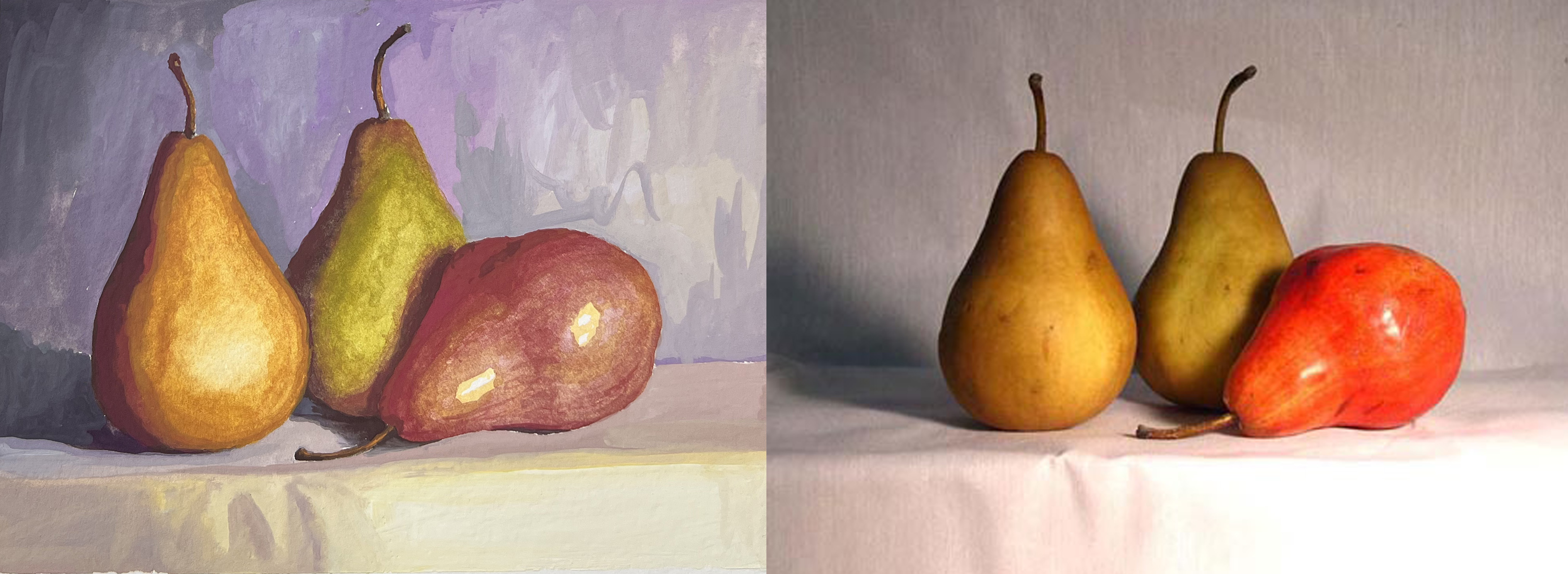
If you look at the reference photo for the study of the three pears you will notice that the red in my painting is not nearly vibrant enough, its shadow isn't dark enough, the background isn't purple, and the shadows on the other pears aren't so red.
That's because in this palette, the magenta combined with black makes a sort-of purple (proving black is blue), and using the yellow to neutralize it also makes the value lighter. When you mix magenta and yellow you achieve red (which is how you know it isn't primary!) but in this case it's a low intensity red: It's not the same saturation that you get with a cadmium or naphthol red. Yet it works well enough!
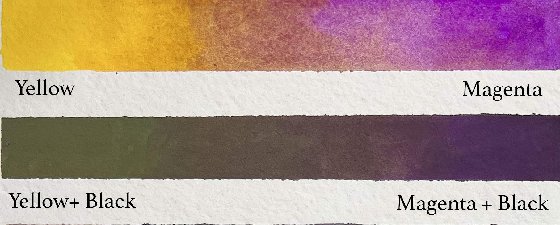
Although results with these experiments can be unexpected, they are always perfectly logical. If you draw a straight line between magenta and yellow on a color wheel, you'll see that line goes perfectly through the red hue. The same if you go from yellow to a low-intensity blue (which is black)... you'll notice that line travels through greens used on the middle pear.
If you're looking to understand color on this level, as well as learn how to use it to create form, distance, composition, and mood, check out Color Theory for Painters. It's available pre-recorded, but is also coming up LIVE in June 2026:

Color Theory for Painters
Live In-Studio & Virtual Class
Saturdays 1-3pm
June 13th - July 25th, 2026
(July 4th is skipped.)
Stay connected with news and updates!
Join our mailing list to receive the latest news and updates from our team.
Don't worry, your information will not be shared.
We hate SPAM. We will never sell your information, for any reason.

