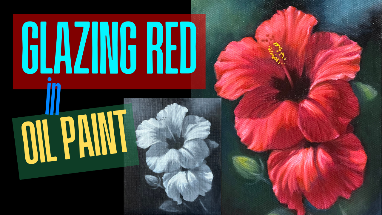
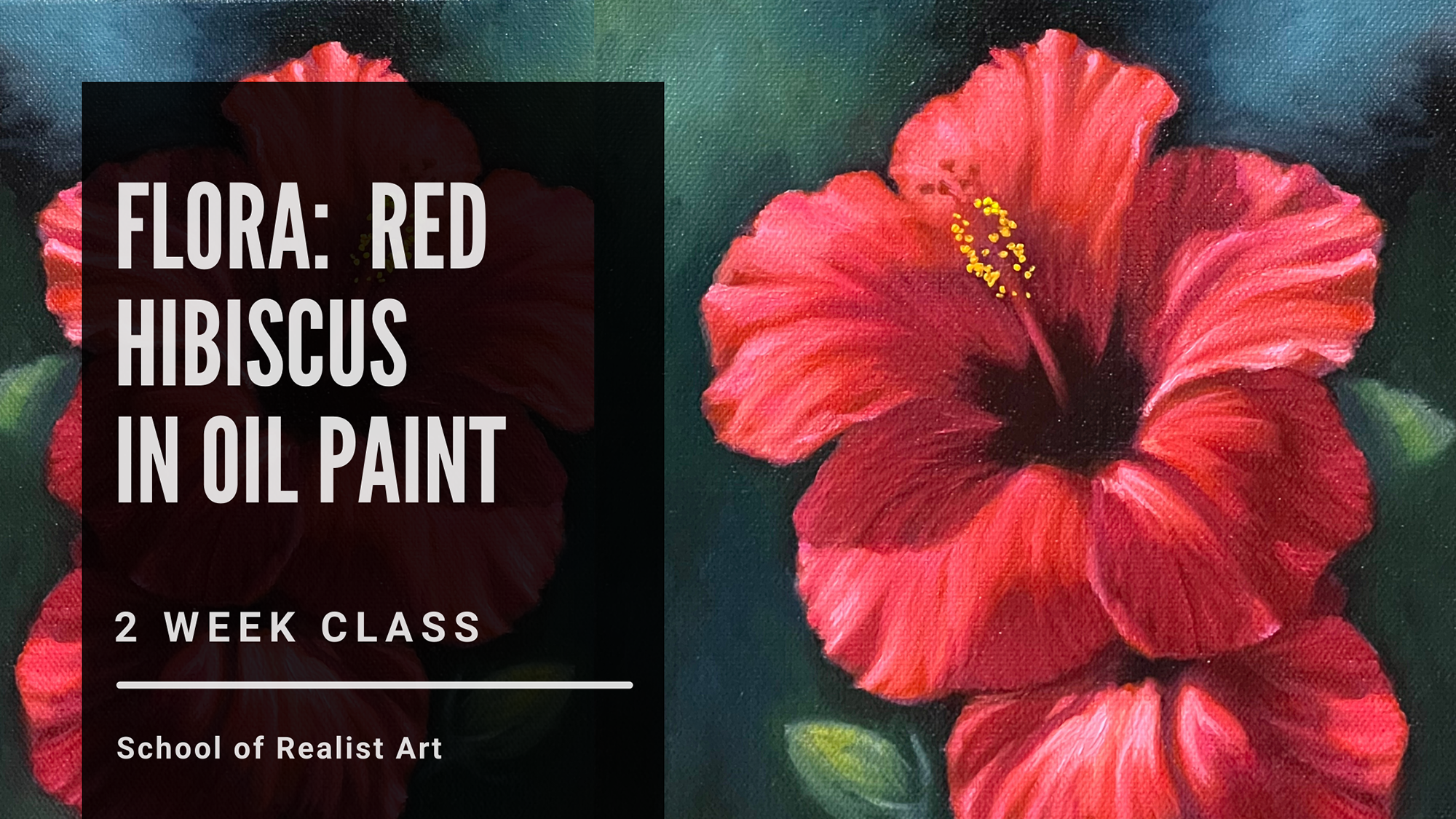
Glazing Red in an Oil Painting: Hibiscus Flower
Recently I created a painting of a Red Hibiscus using the grisaille underpainting and glazing technique, and there's been a lot of interest in it online! So, I thought I'd give you a behind-the-scenes peek at how I made it.
For those of you who want more, you can join me for a live workshop and demonstration where you can paint along this very flower with me! It'll take place August 30th & September 6th 2025 and will be recorded. Get more info here: Red Hibiscus in Oil Paint Workshop
Now on to the process!
Step 1: Creating a Grisaille
Red can be a tricky color to mix and maintain high chroma. This is because warmer reds tend to become brown when mixed with black, while cooler ones quickly lean purple. All reds also lose chroma and either become too cool or peachy when white is added.
Using a grisaille is quite beneficial in this situation, because you're able to control the value in the first layer, and then use transparent color on top after it's dry. When you glaze the color instead of mixing it, the hue stays more true to what's coming out of the tube.
(Want more info on grisailles and underpaintings in general? Check out this post: Underpaintings: Imprimatura and Grisaille Explained )
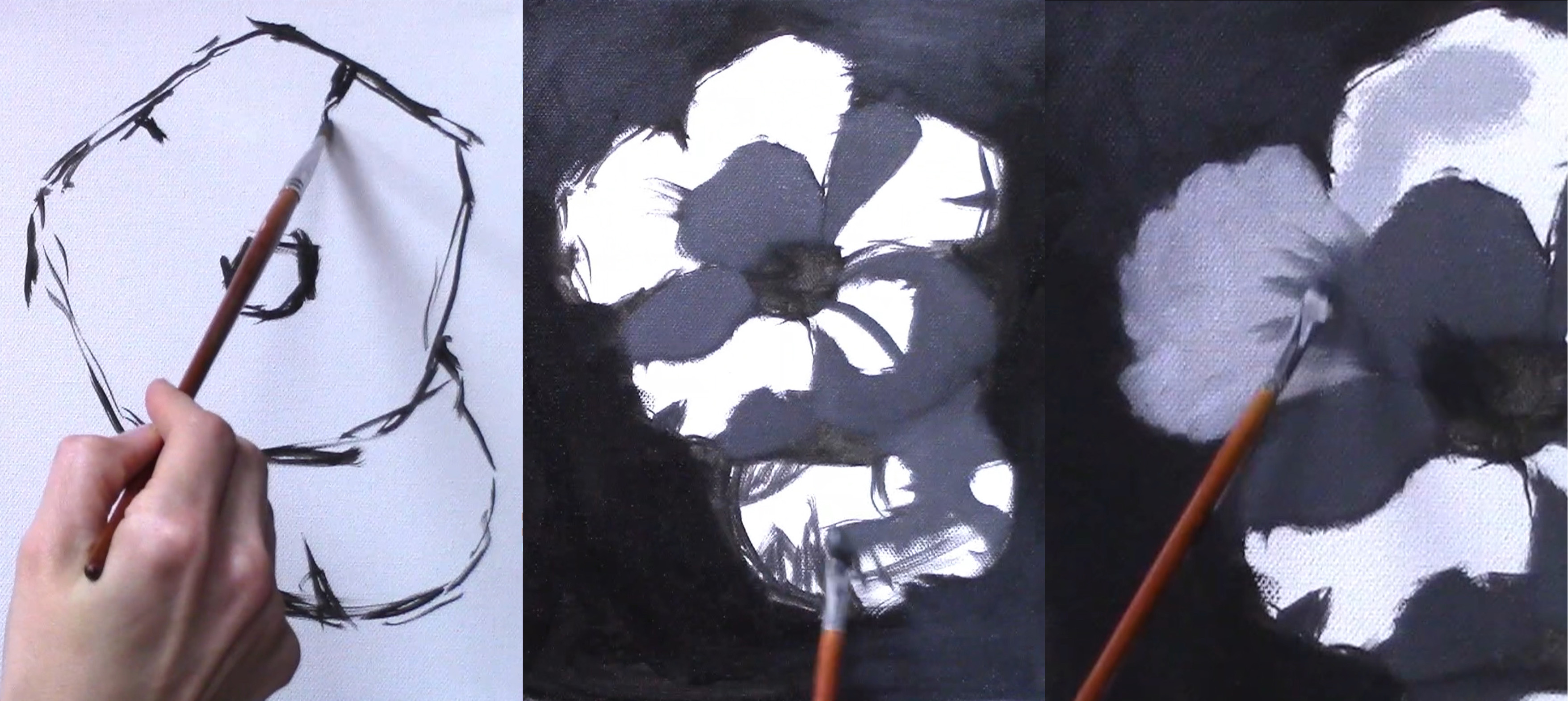
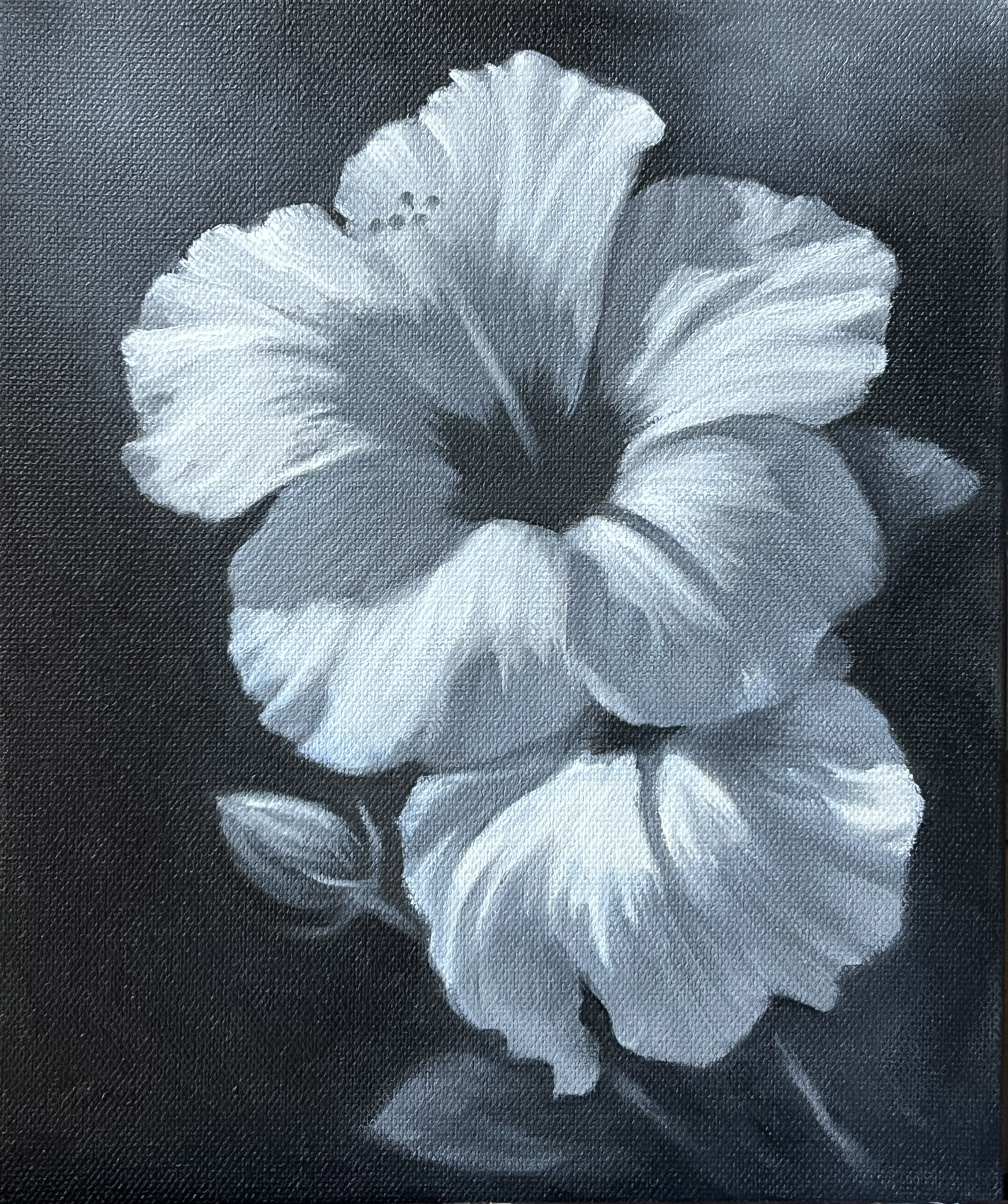
I began by creating a loose sketch with the paint itself. Oil paint is a very flexible medium. I highly recommend skipping a detailed drawing on the canvas if you're comfortable sketching and adjusting because it will prevent you from getting bogged down filling in little specific shapes. The idea is to start with just a few values: a dark background, a broad area of shadow, and a dull light area. Fill everything in with just these 3 values as shown in the images above.
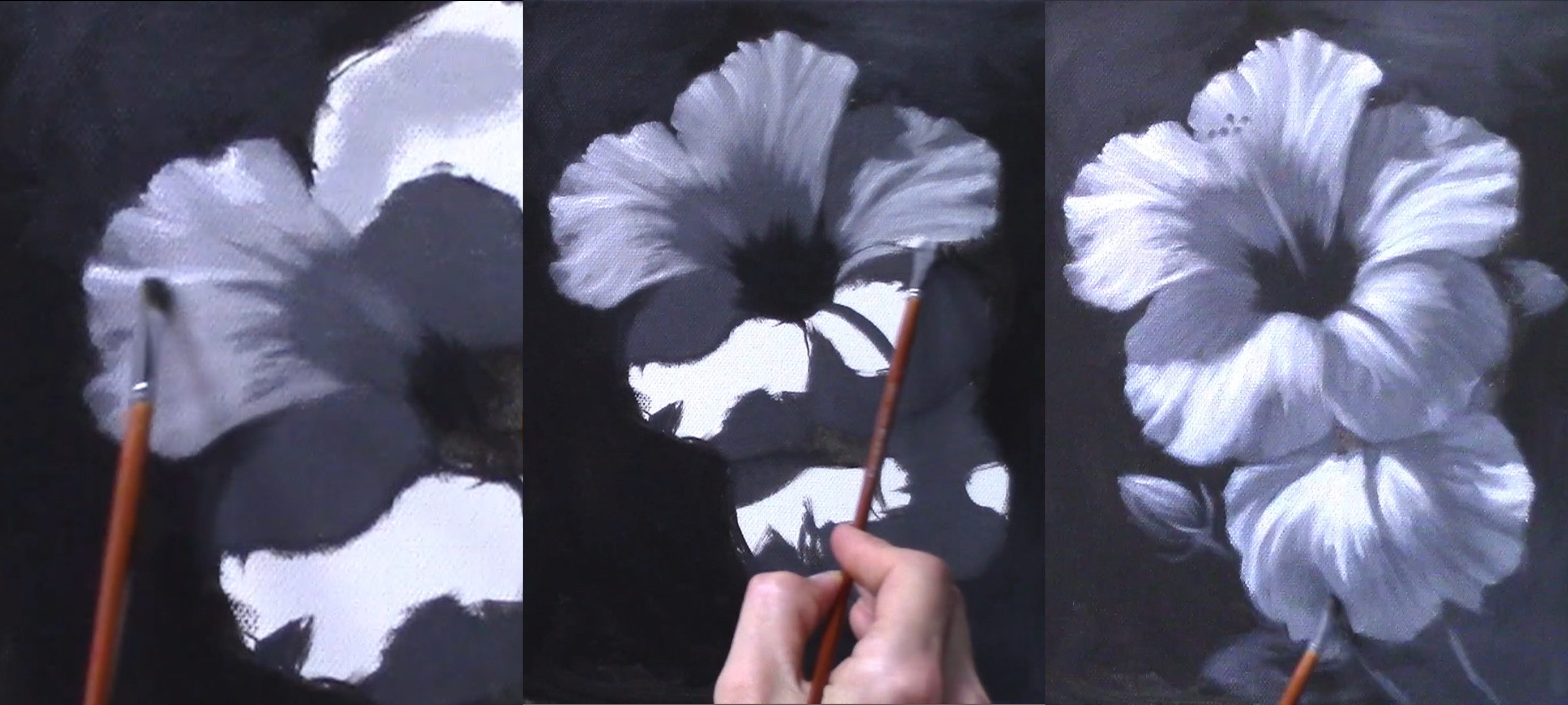
Once you have base values established, start adding white into the light side to build the form. Sometimes allow the white to mix in to the light gray base, and other times leave it brightly sitting on top of the previous layer. Once the form in the lights are established, add some reflected lights in the shadow and details, making sure to maintain value separation between light and shadow.
When you're happy with this layer... LET IT DRY! You cannot glaze on top of wet paint, so wait until you're completely sure your paint has set before you move on to the next step.
Step 2: Glazing
Now for the exciting part! You've been patient and let the underpainting dry, and now you can use transparent color to quickly glaze your masterpiece!
Well, not so fast. Surely there are times when someone might simply drag a little transparent color across a gray painting to bring it to life, but that's not how I created such rich color in this painting. The truth is that glazing represents the base of the color, but more opaque colors are added on top in some (but not all) areas to create that really rich red color.
The first thing I like to do when glazing is to oil out: This means I take some oil and spread it across the dried painting before wiping off the excess. This helps make the paint I put into it transparent, and helps it slide smoothly around the canvas. Too much oil and your results will be streaky! So make sire you wipe it off well.
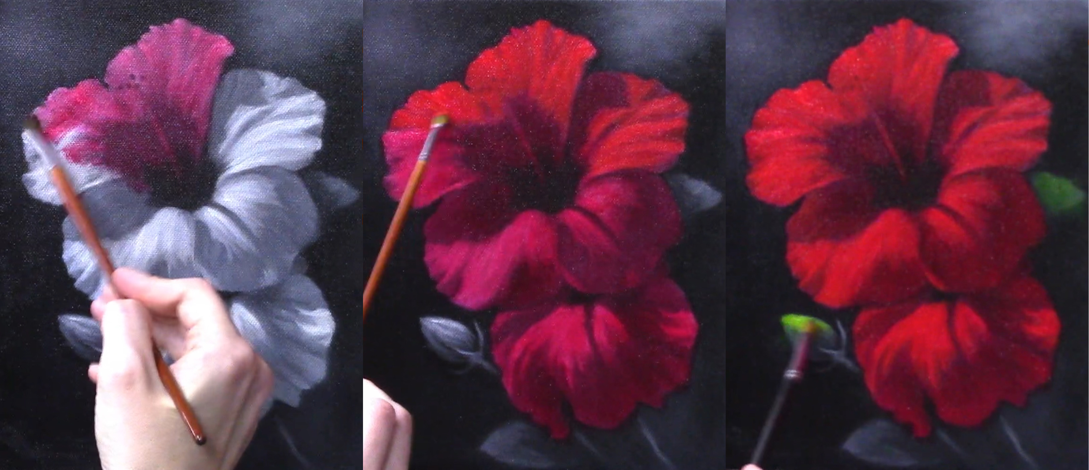
Here I start by glazing with tiny amounts of a cool red: Quinacridone Rose. This serves as my base and it's painted all over the entire flower. Partly the transparency comes from the fact that Quinacridone Rose is transparent, partly the transparency is due to oiling out, but most importantly the transparency here is a result of physically spreading the paint out with the brush. Even oily transparent color will not be very clear if applied heavily! So use small amounts here and spread it around: You can always add more to slowly build up the intensity.
After you have gotten the most out of adding your first cool red to the painting and have built it up for additional chroma where needed, switch to a warmer red, such as Cadmium Red, to add heft to some of the light areas. You can see in the photos above how adding the warmer red made the color much richer. Note that the warmer red was not added in the shadows, only in the lightest areas.
Depending on the color and amount of contrast you're going for, you could decide to add a final layer of dimension on the light side by using a mixture with white in it. I felt the color without the white was more like a poinsettia, and some cooler highlights would balance the warmth and bring it into true hibiscus territory. the key here is to not apply white anywhere except the very lightest areas: If you let white migrate into the warmer lights, the half tone, or into the shadow, all that chroma you worked so hard for will be ruined!
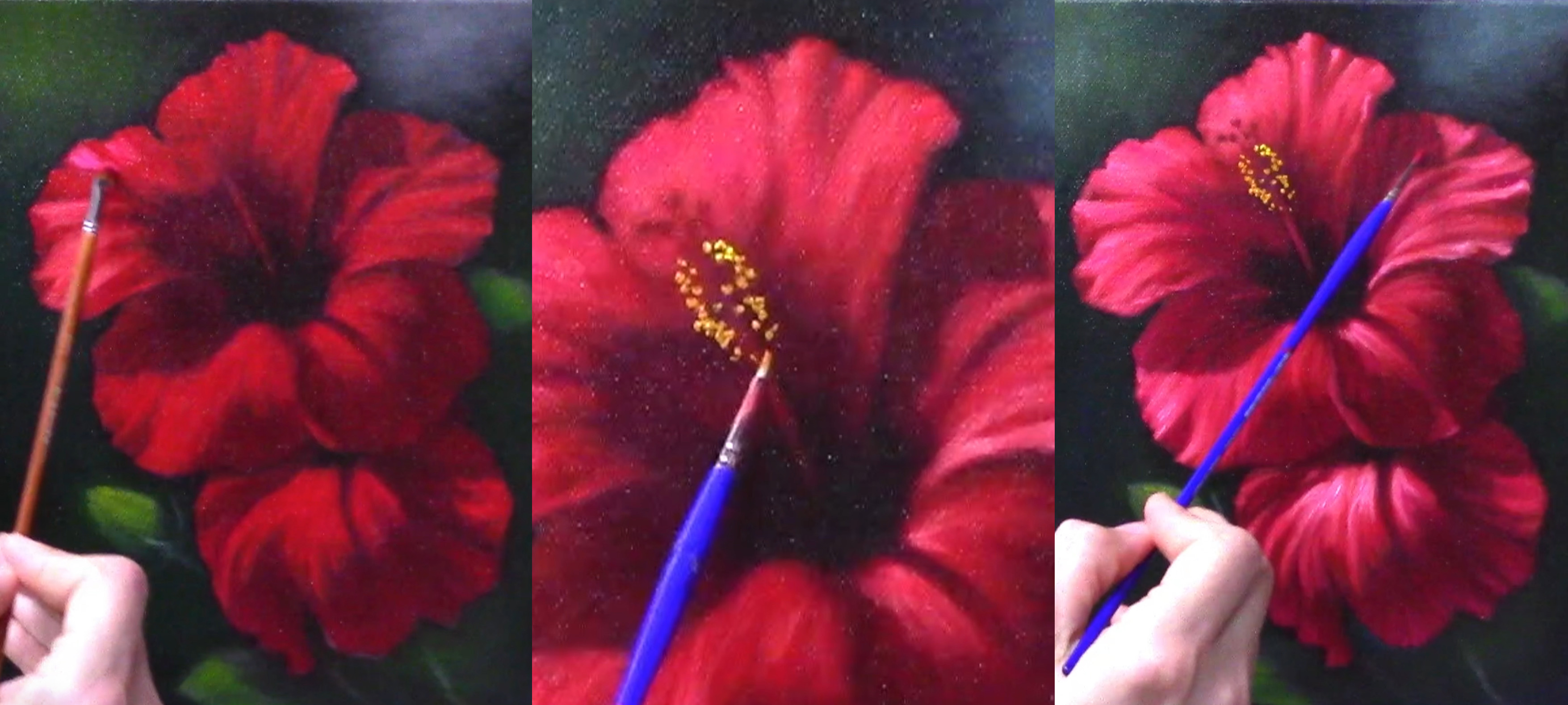
Finally, you can add details and finishing touches on top opaquely. Sometimes people believe that you can't use opaque paint when glazing a painting: Not true! So long as you're mindful of the fat-over-lean rule or working in to a wet layer, you can mix and match all sorts of techniques in oil painting.
(Here's a link to an article about the fat-over-lean rule if you're not sure what that is: An Explanation of the Fat Over Lean Rule )
Paint This Hibiscus With Me!
If you enjoyed this step-by-step article, I'd love for you to check out this class and see if it's a good fit for you! We'll be painting this very image together, live online and in-studio, and it'll be recorded for you to keep. Here are the details:
Red Hibiscus in Oil Paint
2 Week Workshop
August 30th & September 6th 2025
10am-12:30pm CT
Thanks for reading and happy painting!
~Lacey
Stay connected with news and updates!
Join our mailing list to receive the latest news and updates from our team.
Don't worry, your information will not be shared.
We hate SPAM. We will never sell your information, for any reason.

